Adding math notation
On some occasions, one might need to add math notations on a plot. To do so, add expression() to the ggplot expression.
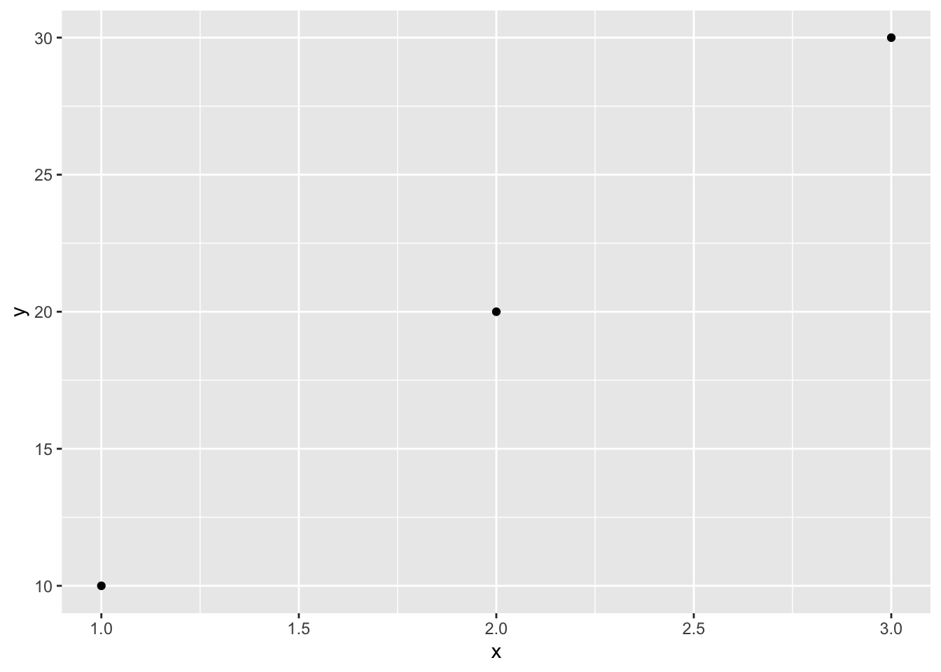
Consider this very simple example:
##   x  y  y2
## 1 1 10 100
## 2 2 20 400
## 3 3 30 900
What y2 means here is essentially “y square”. Plotting x and y is relatively straightforward:
ggplot(dat, aes(x = x, y = y)) + geom_point()
But in order to plot y2, one would consider updating the name of y-axis to avoid confusion, in this case, making 2 a superscript to become \(y^{2}\).
ggplot(dat, aes(x = x, y = y2)) + geom_point() +
        ylab(expression(y^{2}))
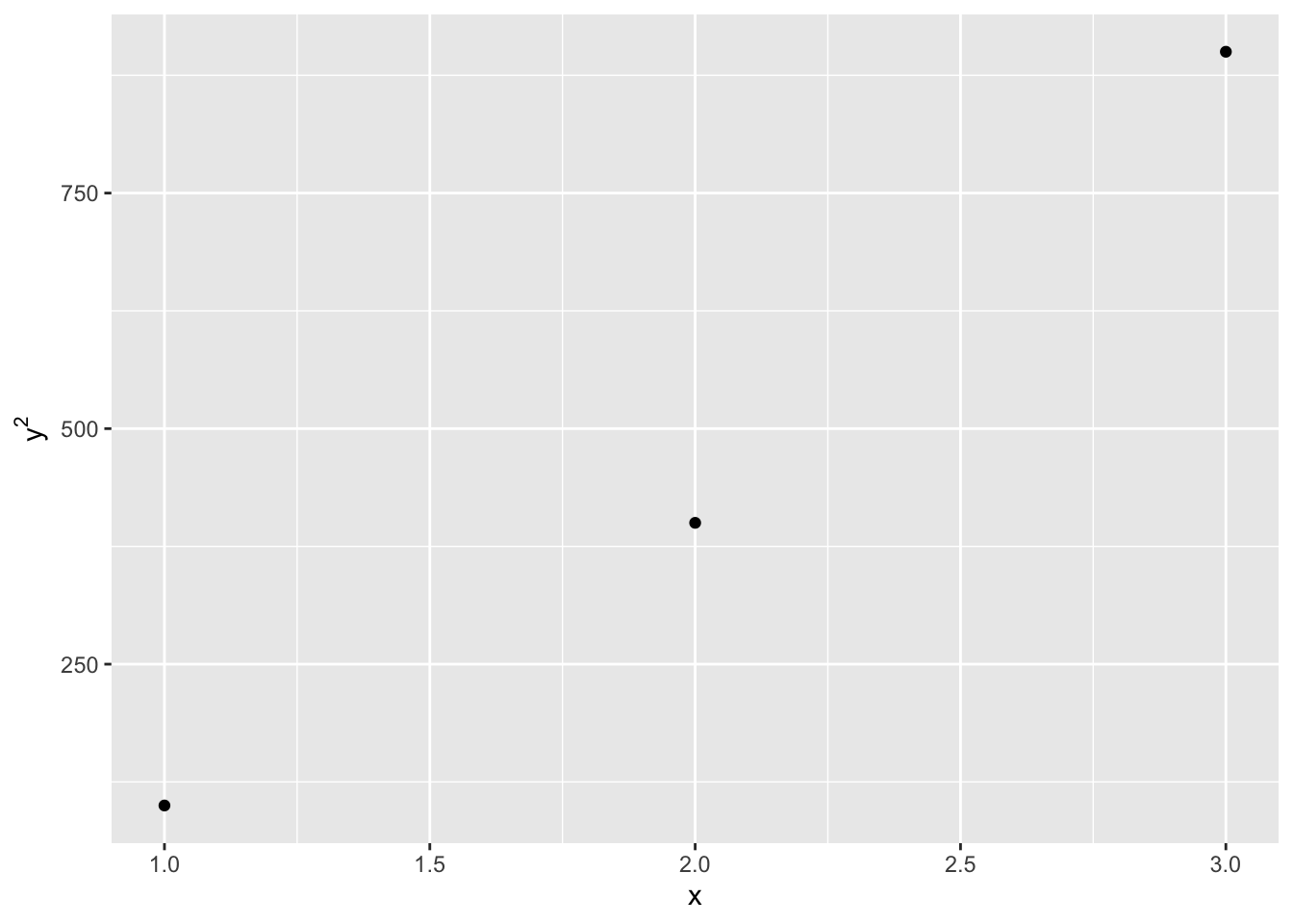
Note that the math expression cannot be bolded.
Defining customized ticks
This can be achieved by adding the following functions to the ggplot expression, depending on which axis (x/y) and the type of variable (discrete/continuous):
scale_x_discrete()scale_y_discrete()scale_x_continuous()scale_y_continuous()
where the break attribute would need to be specified.
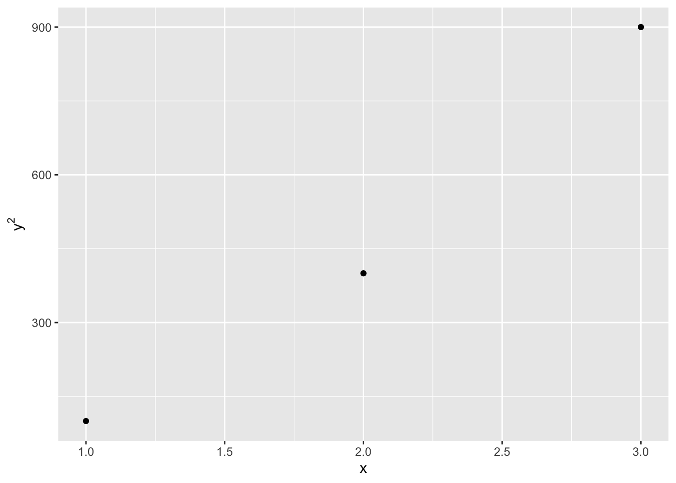
Let’s work on one of the examples above that plots out \(y^2\). I’d like to specify the y ticks so that it shows 900 on top.
ggplot(dat, aes(x = x, y = y2)) + geom_point() +
        ylab(expression(y^{2})) +
        scale_y_continuous(breaks = c(300, 600, 900))