A good table can be visualised quickly
The more I work on data visualization using R, the more I realized that a good table has a clean structure and requires much less effort to be plotted out.
In ggplot, this often means that if a table requires more than a melt() in {reshape2} package then the table is not good enough - needs some more cleaning.
Working example:
d1 <- iris
d1 %>% head()
##   Sepal.Length Sepal.Width Petal.Length Petal.Width Species
## 1          5.1         3.5          1.4         0.2  setosa
## 2          4.9         3.0          1.4         0.2  setosa
## 3          4.7         3.2          1.3         0.2  setosa
## 4          4.6         3.1          1.5         0.2  setosa
## 5          5.0         3.6          1.4         0.2  setosa
## 6          5.4         3.9          1.7         0.4  setosa
d1_melted <- d1 %>% melt(id.vars = c("Species"))
d1_melted %>% head()
##   Species     variable value
## 1  setosa Sepal.Length   5.1
## 2  setosa Sepal.Length   4.9
## 3  setosa Sepal.Length   4.7
## 4  setosa Sepal.Length   4.6
## 5  setosa Sepal.Length   5.0
## 6  setosa Sepal.Length   5.4
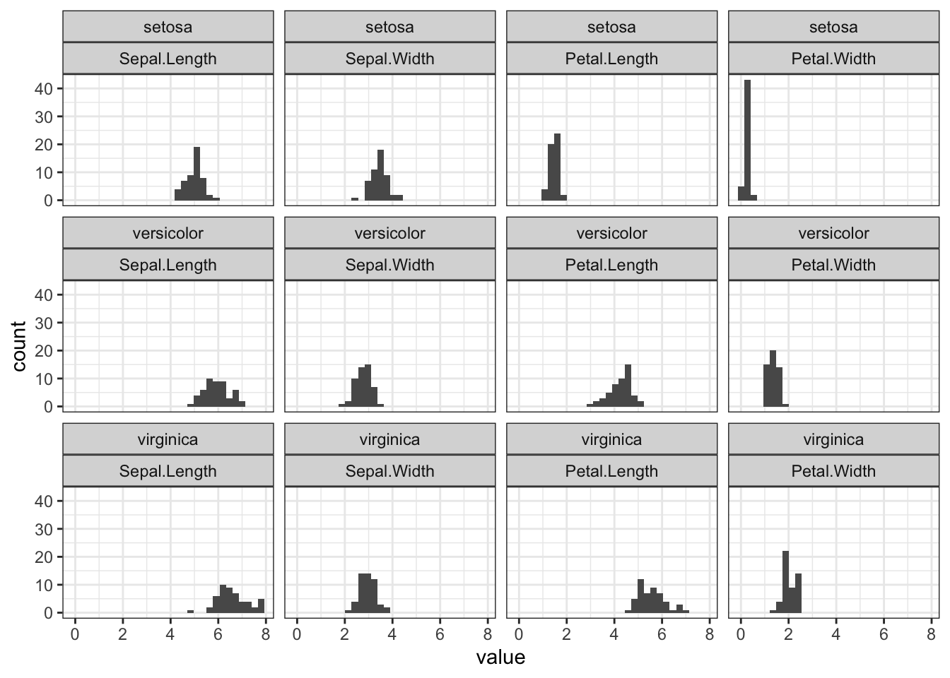
The facet_wrap() function can create subplots according to defined attributes. Here, I’d like to:
- display different
Speciesvertically, and - along each row to plot out length and with of sepal and petal. Now that these data are stored in
variableandvaluefrom themelt(), they can be specified in ggplot expression.
d1_melted %>% ggplot(aes(x=value)) + geom_histogram() +
        facet_wrap(Species ~ variable) +
        theme_bw()
## `stat_bin()` using `bins = 30`. Pick better value with `binwidth`.
Take home message: Be goal-oriented and thinking backward. Better-engineered data allows visualization and decision-makingm more efficiently.